Carin Goldberg
The artist name is Carin Goldberg who was an American graphic designer and brand consultant, she was born in 1953 in New York city and passed away in 2023. She studied in The Cooper Union and graduated in 1975 after receiving a BFA from the school. Later on, after her studies she worked with an art director called Lou Dorfsman at CBS television where she was creating ads for Tv guide. She then went on to work for CBS and Atlantic Records and left in 80s to start her own business. Over a number of years, she created many albums covers for well known artists such as Steve Reich, Glenn Gould, Sly And The Family Stone and Madonna.
Madonna's frist album tilted "MADONNA"

Carin GoldBerg most-known work is the cover she made for Madonna’s first album titled "Madonna" which debuted in 1983. Carin Goldberg made this album shortly after establishing her own studio titled "Carin Goldberg Design" in 1982.
Extension

Who is the Music Artist? The artist of this album cover is an American funk band called "Sly and the Family Stone," they where formed in San Francisco, California in 1966 and where active until 1983.
What Genre of music is the Album? The genre of music in Sly And The Family Stone's album "Anthology" are Funk, Psychedelic Rock, Classic Soul and Classic R&B.
What Visuals are depicted on the album cover? On the album cover there is a band mate called "Sly Stone" who appears to be posing in a dance funk way. The album is black and white and features typography on the very top of the album, telling who the band is and the title of their album.
What do you think these visuals “mean” or represent? I think these visuals represent the band's true core by showcasing a band member posing in a stylish way, showing the energy and cool vibe of "Sly And The Family Stone Anthology". The Black and White style gives it a classic and powerful vibe to it matching the funk and soul music the bands plays.

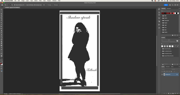
My album covers inspired by Carin GoldBerg


What creative media techniques did you use? The creative media techniques I used were portrait photography, outline, posterised effects and black and white. We took portrait-oriented photos of our classmates and increased the lighting on their faces to make the photos appear brighter.
What software did you use? How? Why? We began by importing our photos into Lightroom to brighten the backgrounds, making them appear whiter. Next, we transferred our photos to Photoshop and followed a step-by-step tutorial on how to create a look inspired by Crain GoldBerg's "Sly and the Family Stone" Anthology album. The tutorial taught us how to convert our photos to black and white and how to outline and posterise our photos to achieve a more pixelated look.
What did you struggle with? The part I struggled with the most was posterising the photos. It was quite challenging at first because I had to carefully balance the posterising effect to make sure the photos didn't look too pixelated. However, after spending some time on it and knowing how I wanted the posterised photos to look, it became easier, and I eventually got the hang of it.
Why did I choose these types of layouts for my album? I chose the first layout for my album to match the vibe of the photo. The photo brings out a soft and pure vibe, and I wanted to mimic that by making the album cover appear innocent and angelic. Hence why I chose a cursive font and named it "Echoes Of Me". I believe the phase "Echoes Of Me" evokes a soothing and quiet vibe, making the album feel somewhat calm and gentle, and almost bringing connotations of memory and reflection.
I chose the second layout to also fit the vibe of the photo, but I wanted it to be a bit different then the first one. I chose a more greyer layout and made the fronts bolder. The second album has a more cute and lovely vibe to it rather than an angelic and innocent vibe like the first album.
PhotoShop

PhotoShop